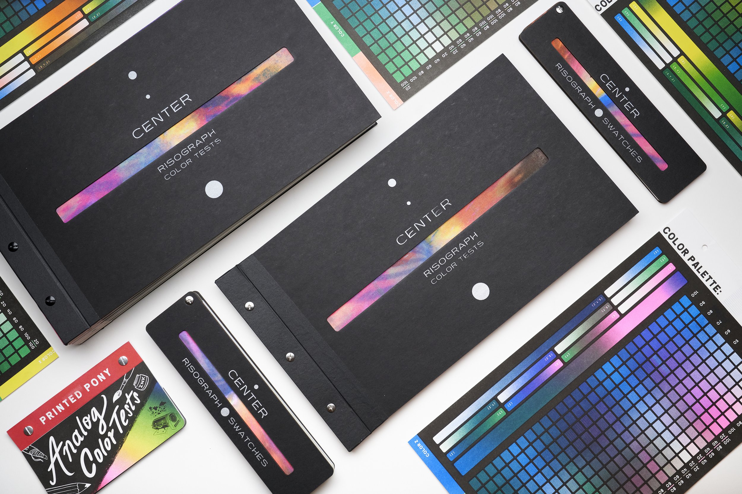
Center Color Theory
I have a diverse background in printmaking collaborating and teaching various printing methods in academic and community art spaces. These jobs inspired me to develop Riso resources and color tests to demystify the medium and make it more approachable to my students and clients. And now these resources, and color tests are exclusively available to you to continue to evolve your risograph practice.
Two Color Test
Risographs utilize soy or rice oil-based inks. These oils hold onto pigment beautifully and create a variety of vibrant and fluorescent colors with luminous transparency. Overlaying multiple colors mix to create a wide spectrum of new shades, this is one of Riso’s biggest advantages- encouraging a work smarter not harder approach to designing a piece and limiting colors for ease of production and maximum mixability.
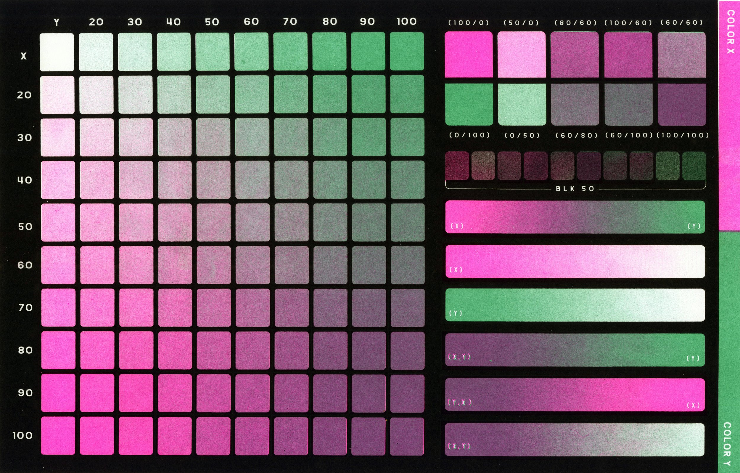
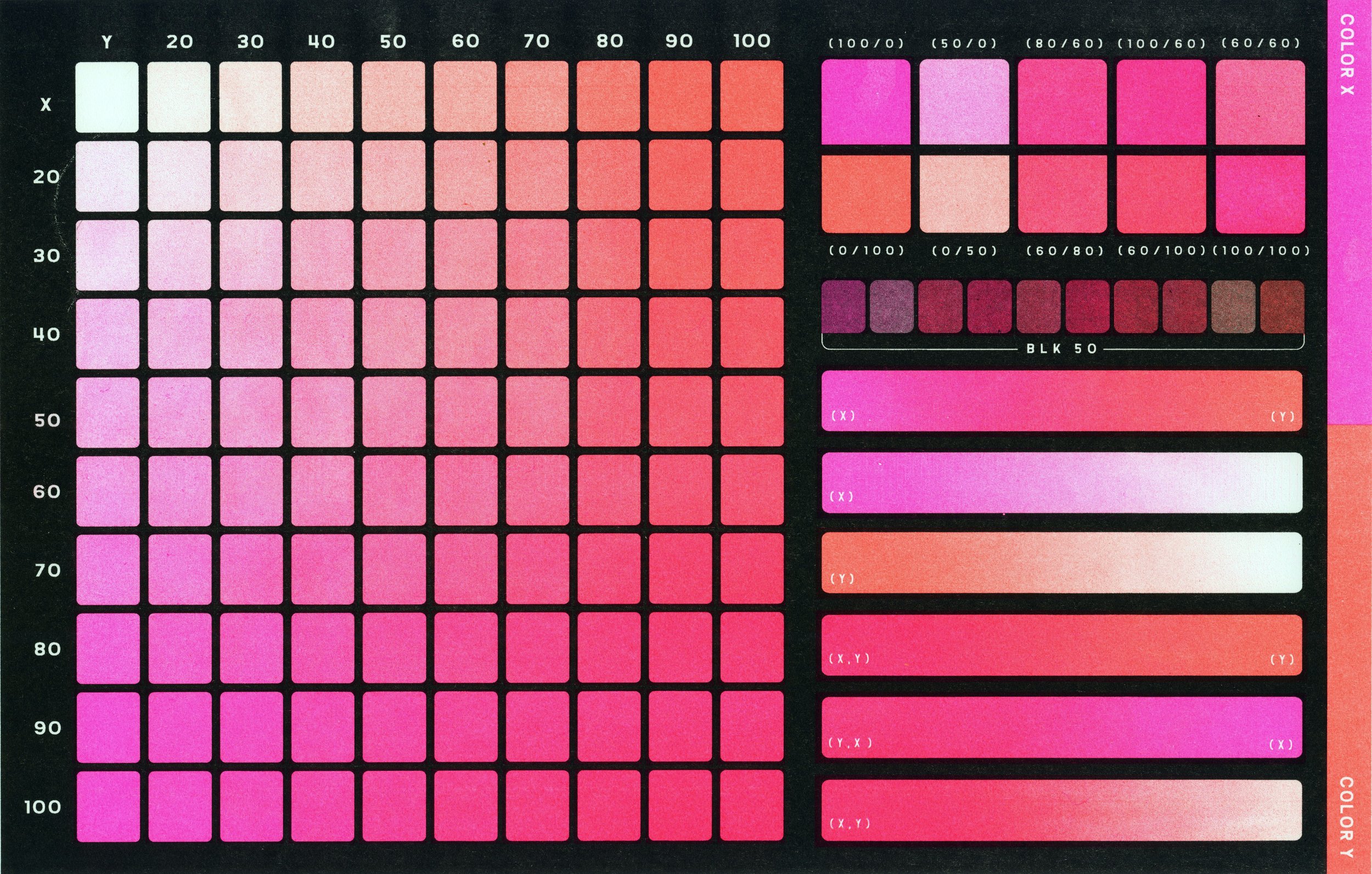
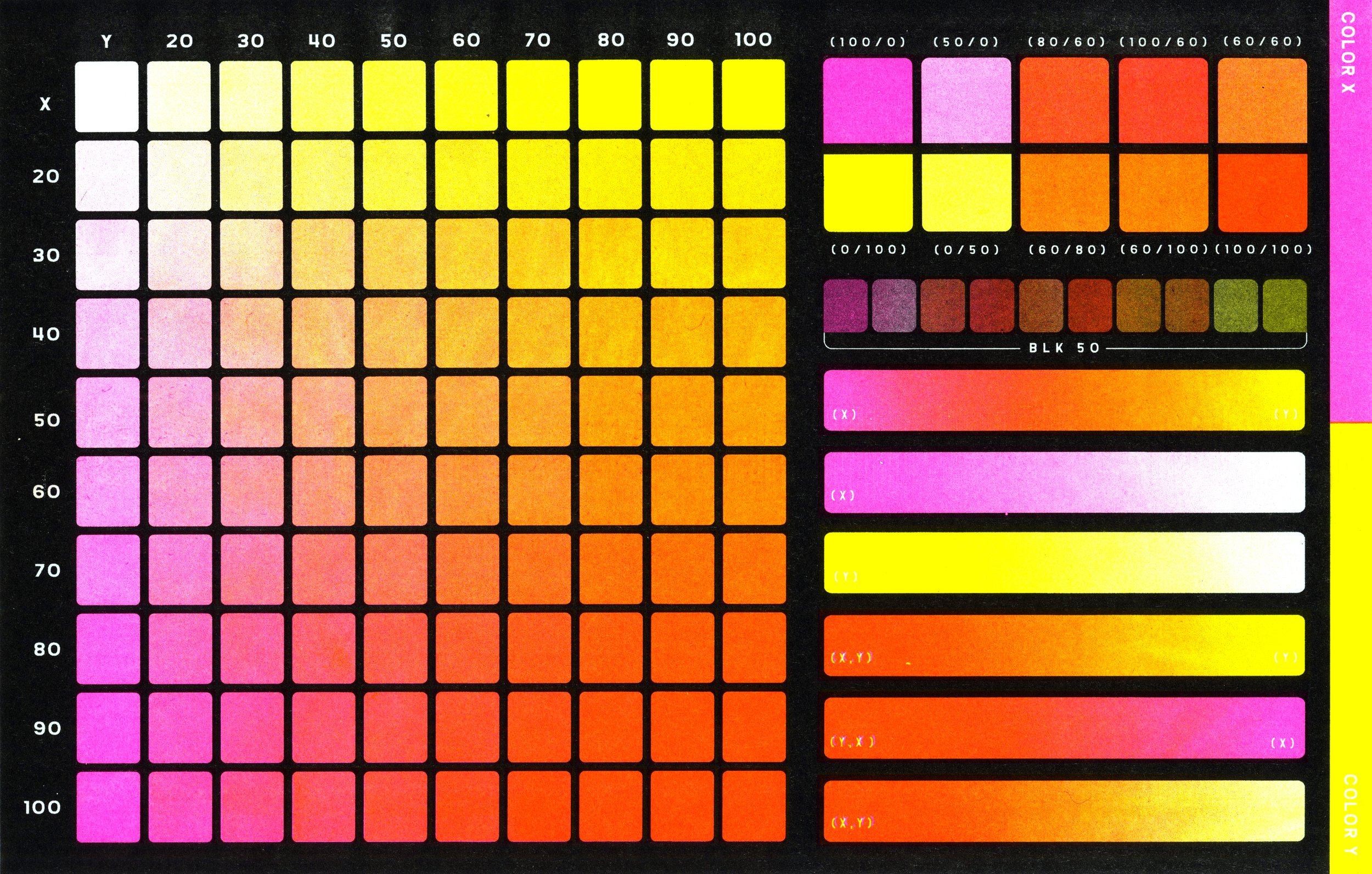
I wanted to bring this same mindset to approaching my design of a two-color test. This test includes all options for two color gradients, swatches of average go-to shades, those same shades with 50 percent black overlaid, and an overall black trap layer to reduce the potential appearance of misregistration.
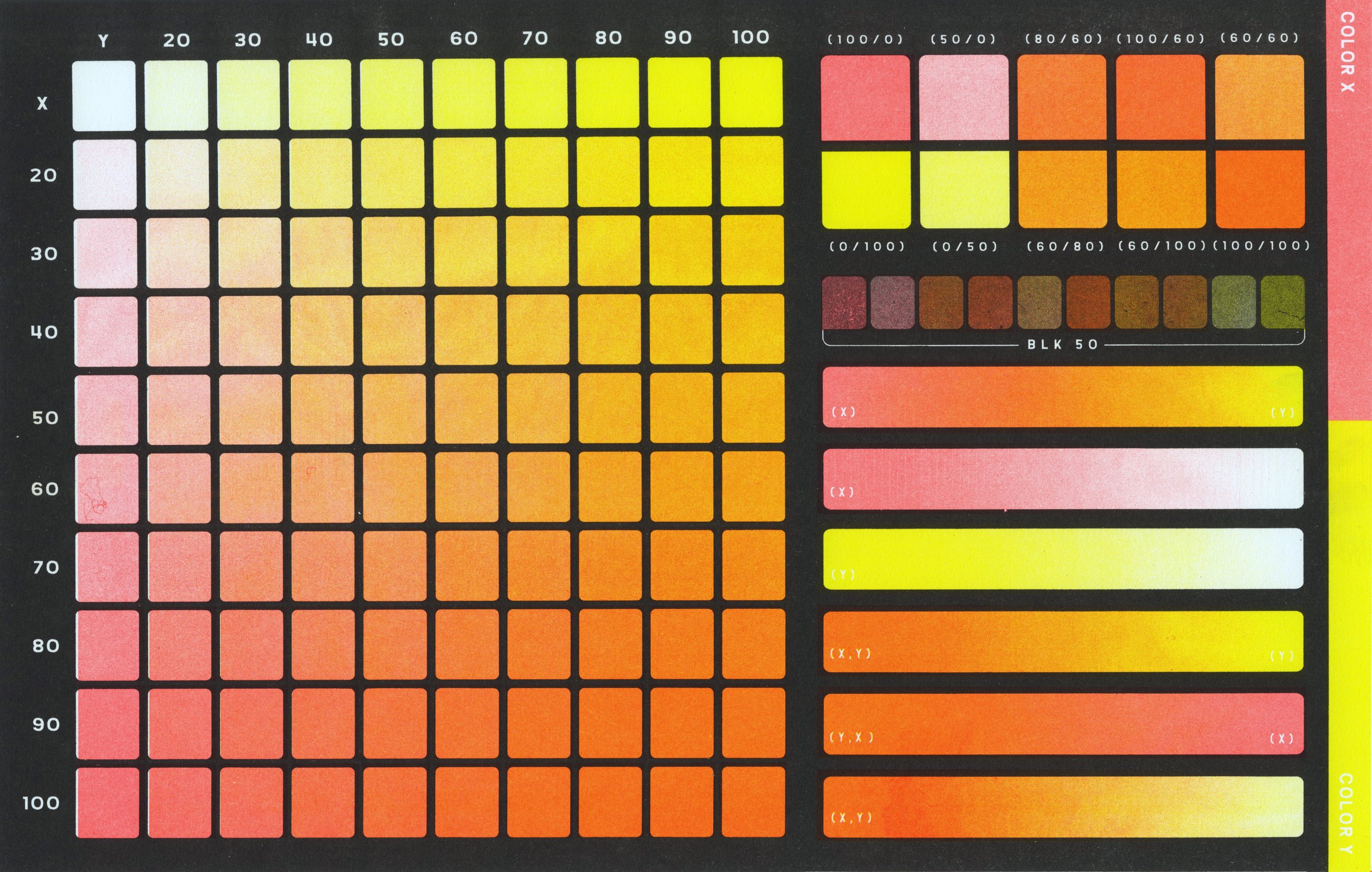
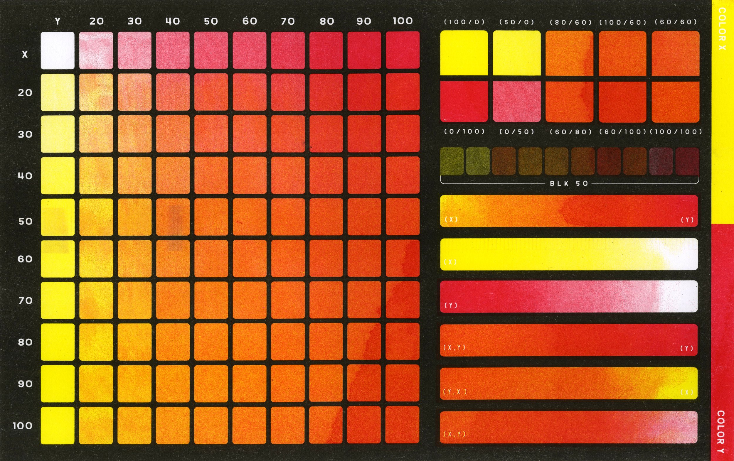
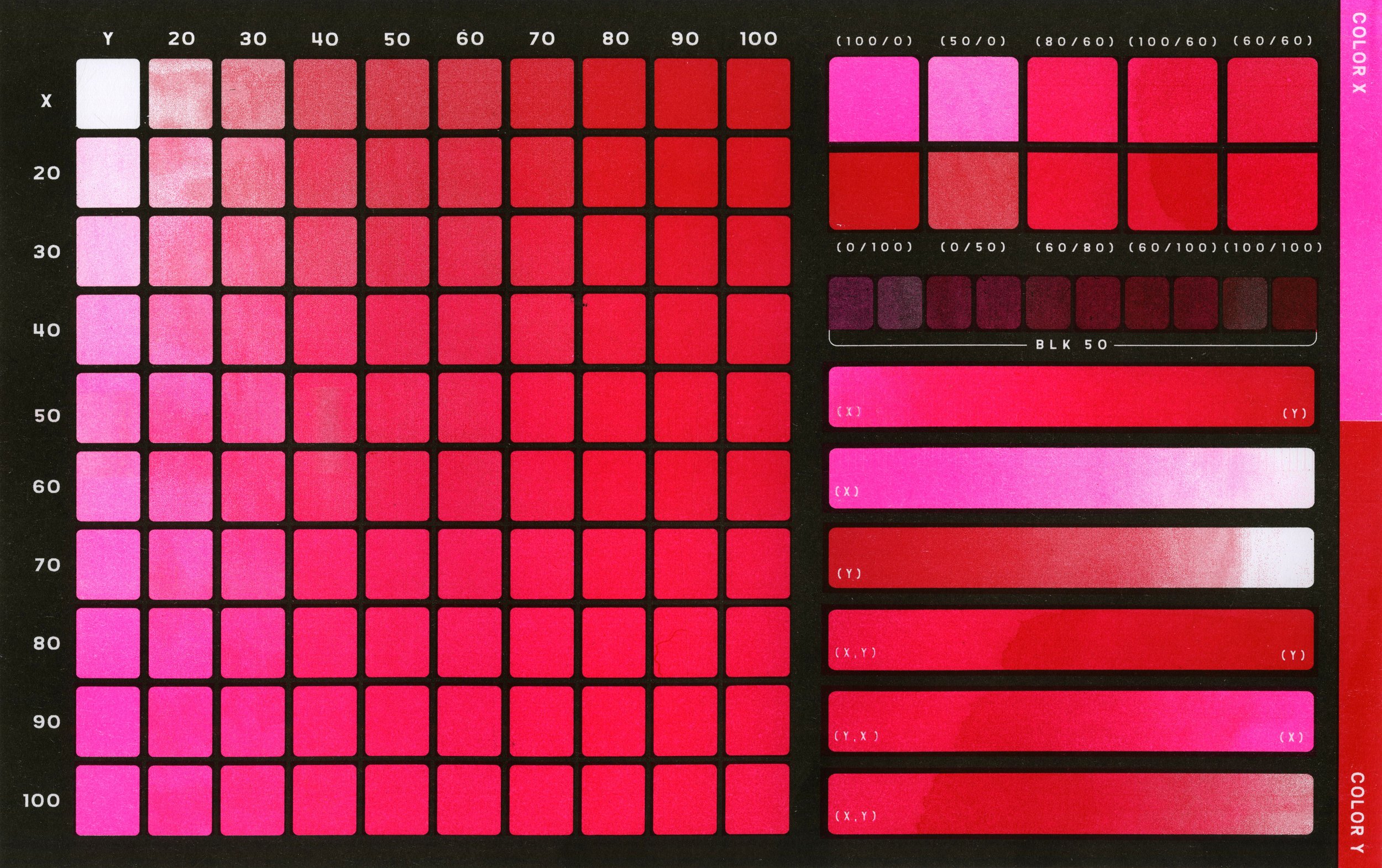
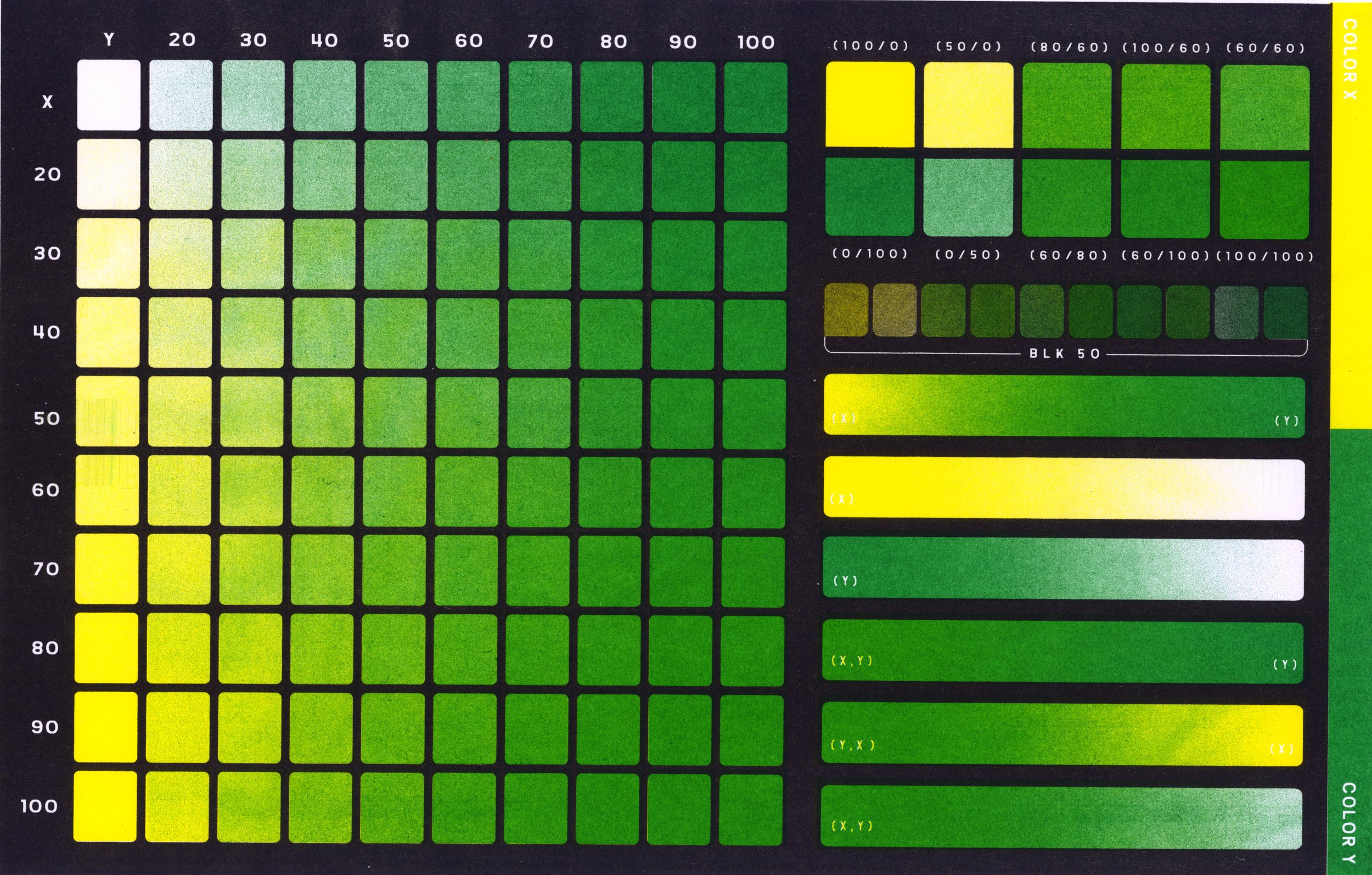
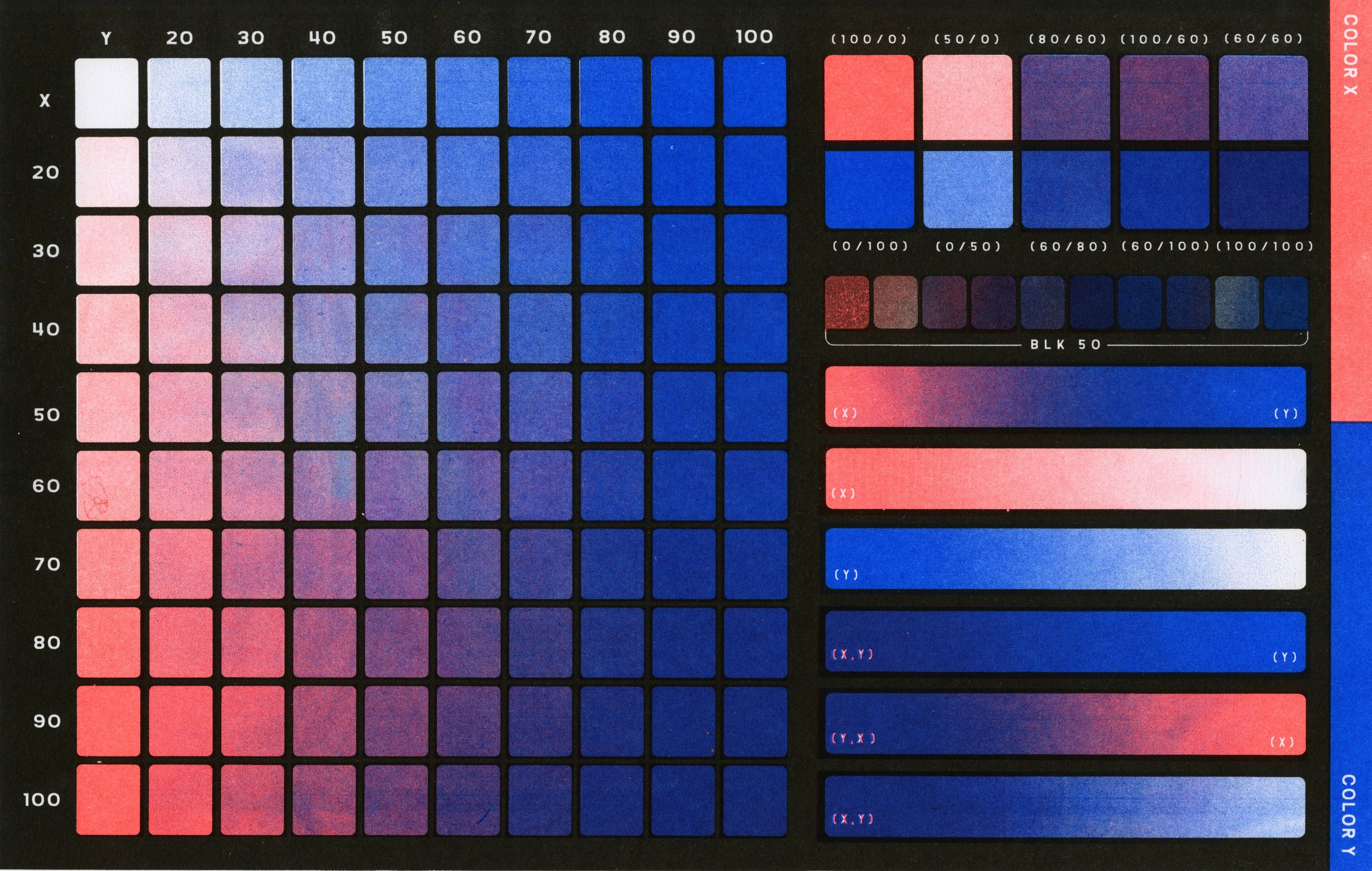
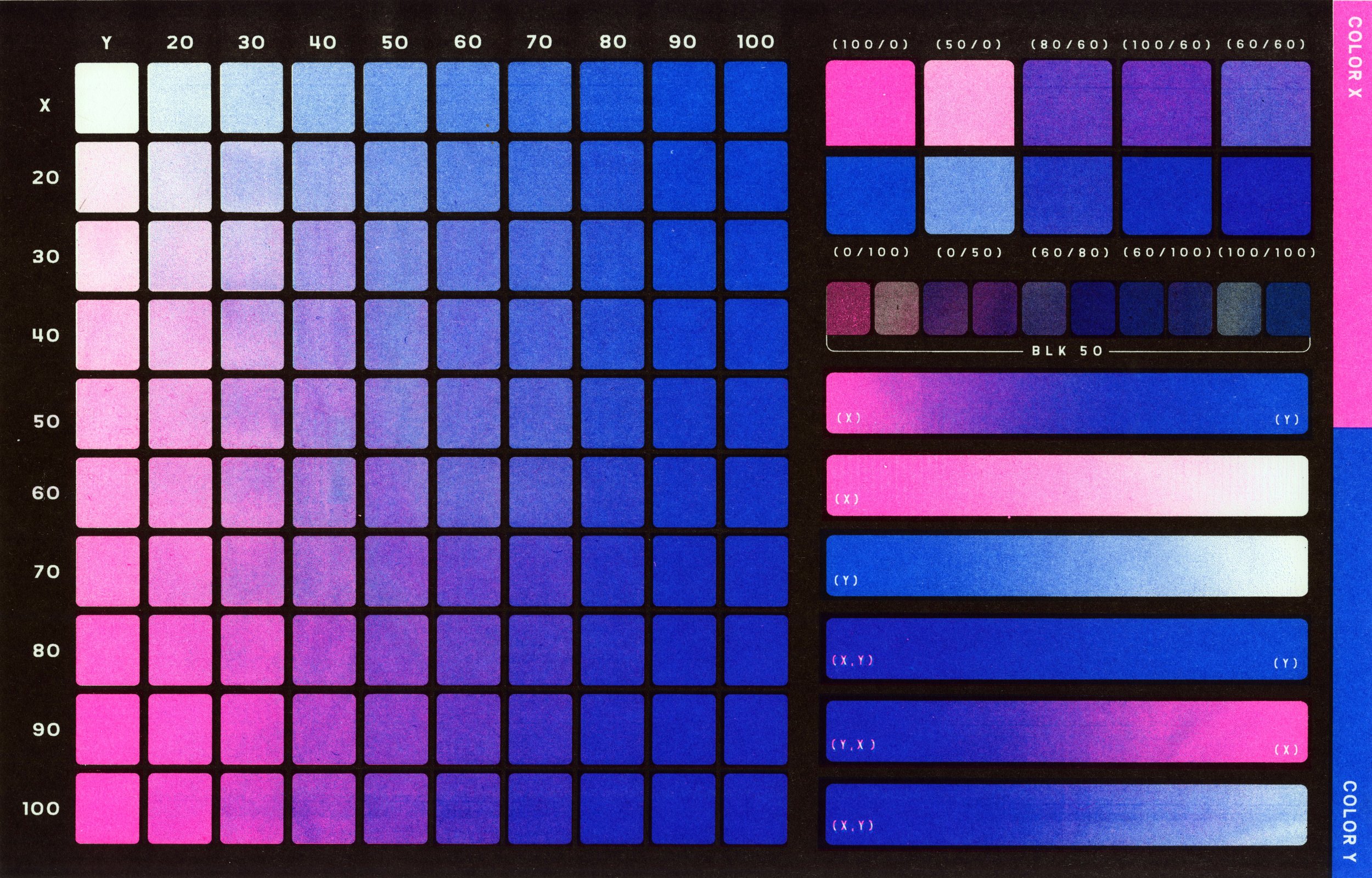
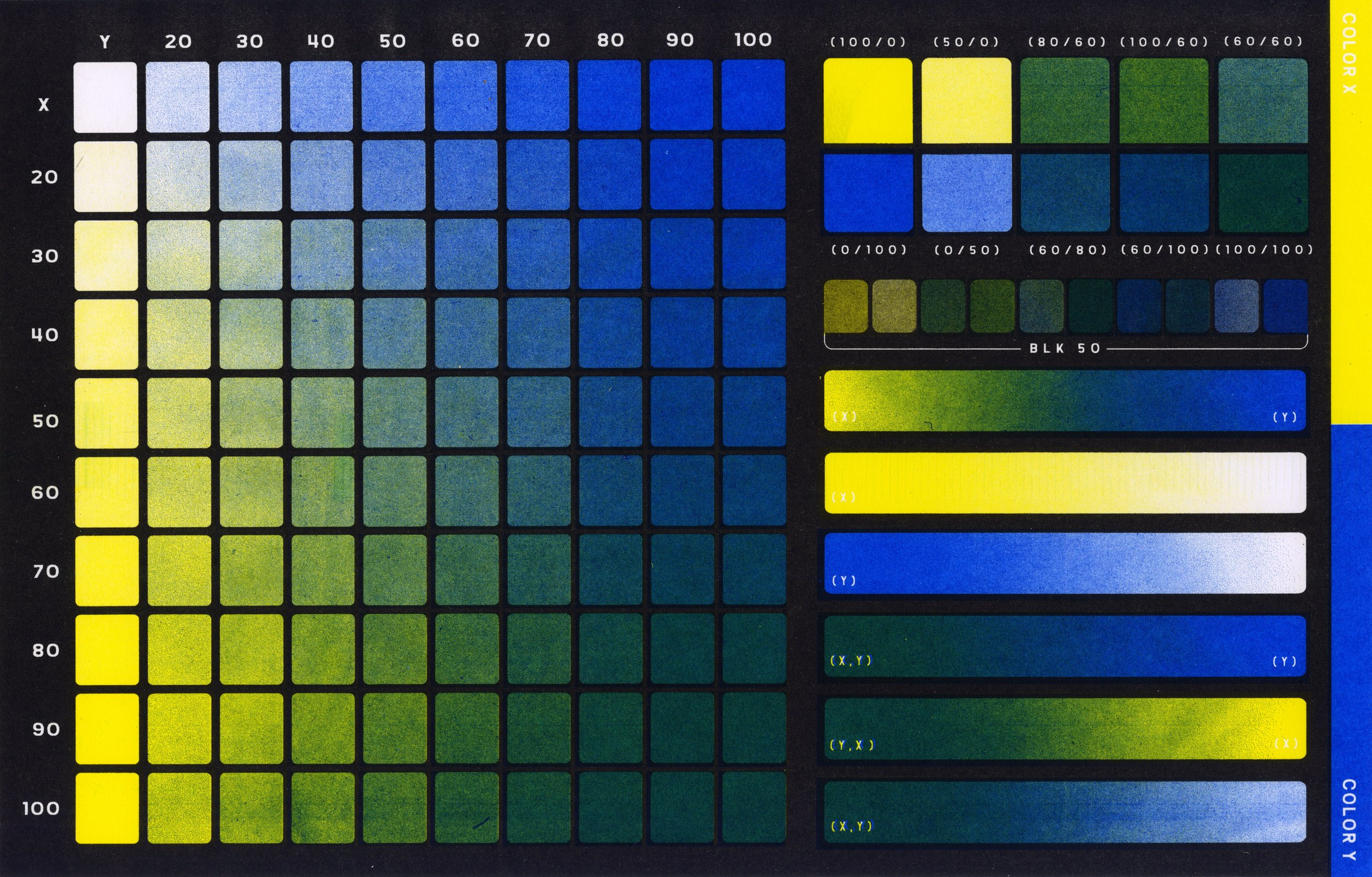
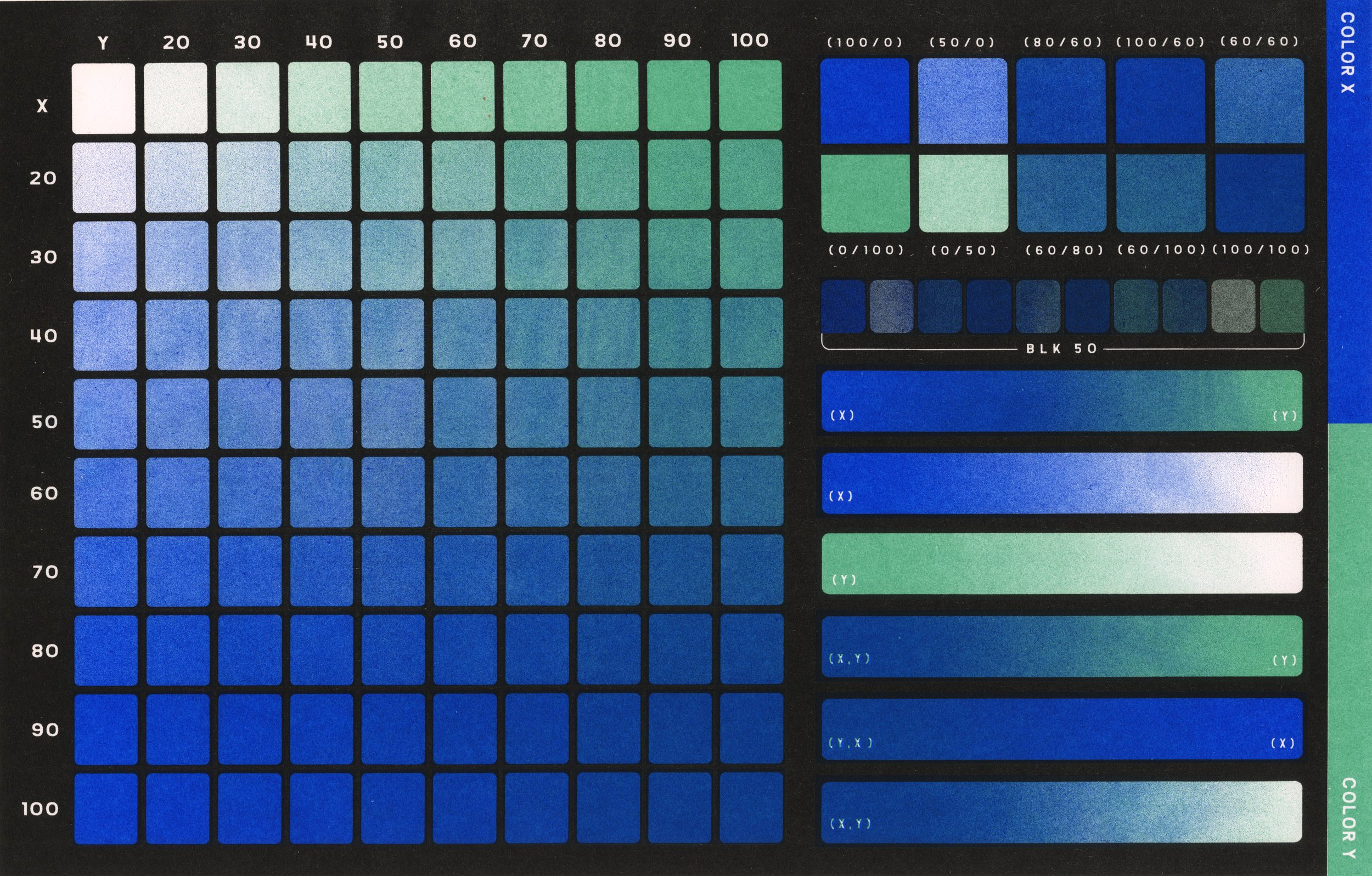
Three Color Tests
Approaching creating a readable three-color test posed multiple problems; from the appearance of a smooth mix of colors to a way of reading each color value effectively. This final design leans on using a midsection of rations with a middle line in the color of what color is more dominant in that row vertically. For example, a yellow line over 100/20 would indicate that ratio is dominantly yellow. Coming from the horizontal axis that ratio is overlaid in varying degrees the Z color in 10 value steps.
Swatchbooks
The swatchbooks evolved out of a need to create color tests that included the color black. The original design for all of my color testing features a black trap layer making it much harder to read if black is included in the color palette. On the side of each swatch page features a small two-color chart of the selected color plus various opacities of black
Swatchbook on colored papers
Swatchbook on white paper
Analog Swatchbook
Designed for those who prefer traditional mediums and scanner bed master making, this pocketbook of one-color tests features different analog mediums at 100 percent opacity (heavy application) and 50 percent opacity (light application). Bound with Chicago screws, 7 pages of analog medium color tests: graphite pencil, charcoal pencil, grease pencil, powdered graphite, india ink, pentel brush tip pen, and copic marker (black)
Printed in 7 striking colors: Flo pink, bright red, yellow, kelly green, medium blue, metallic gold, and black